
Originally published: March 6, 2015
Summary
The stock market & US economy have continued to improve, and may have significant upside remaining, but major dangers exist.
Oil's collapse from over $100 to nearly $40 signals either an upcoming recession or a continued recovery, but which one?
We expect 2015 to be a sub-par year (-7% to +7%), but a big surprise up or down is definitely possible (+20% or -15%).
Regardless of outcome, we think the beaten-up Energy, Commodities, & Industrials sectors present the best value.
[Originally published in Chart Prophet Capital's "Q4 2014 Report & 2015 Outlook", January 15, 2015]
ChartProphet, January 15, 2014:
Bullish Scenario:S&P 500 - 1980 [Actual Outcome: 2058.90]Dow Jones Industrials - 17800 [Actual Outcome: 17,823.07]…The key to predicting the outcome is to pay attention to when the market is overheated and/or approaching strong resistance levels (such as S&P 2000, Dow 18k).
2014 Recap & 2015 Outlook
The stock market continued positively higher on its path of uncertainty in 2014, but crude oil (NYSEARCA:USO) prices and energy companies (NYSEARCA:XLE) crashed. Usually the stock market and the energy sector (or commodities more broadly) move for the most part in the same direction, but there has been a massive divergence since mid-2014. All of a sudden, oil (NYSEARCA:OIL) has dropped from over $100 to below $50 while the overall stock market (NYSEARCA:SPY)(NYSEARCA:DIA) is at all-time highs.
Such a sharp drop in energy prices warns of a deflationary period that quite often leads recessions, which could mean a very rocky 2015 for stocks. On the other hand, such a massive decline in energy and, in turn, lower input costs could be a huge boost to the consumer as well as to the overall economy; under such a scenario, it is possible that the economic recovery gains steam and even surprises to the upside with robust growth and strong momentum. However, there are plenty of reasons for stock market turbulence ahead: US Dollar (NYSEARCA:UUP) strength, commodity prices almost wiped out, still uncertain European and Emerging Market (NYSEARCA:EEM) economies, and a prolonged period without a stock market correction to name a few.
The potential outcomes for 2015 include a wide range of scenarios, such as a boring and rocky flat performance (0-10%), a rapid acceleration of the bull market (+20-30%), a mild recession (-10-25%), and even a full-blown crash (-30-50%, though this is far less likely). With Dow 18,000 as our current battleground, we will soon find out what the trend is, at least for short-term.
As it pertains to the long-term trend, it appears that we are in the recovery phase of the economic cycle but must keep an eye open for early signs of a recession. A major market crash or depression may be a long time away, but at least a mild recession is almost guaranteed within 1-3 years. Nevertheless, the momentum is still to the upside and an economic breakout with more vigorous growth could be just ahead.
As we will discuss below, the market (almost always) has a range of possible outcomes, and in our case there are 3 main scenarios which could play out. Keeping the scenarios in mind will not only help you predict & be prepared for where the market may be headed, but will also give you an advantage in understanding exactly what is unfolding.
I. Oil & Stocks
The scariest move in the markets of 2014 was the crash in oil. Not only did the price of oil plunge by more than 50%, but it did so while the stock market continued higher, which now makes it even more confusing for investors, economists, analysts, central banks, and policymakers worldwide. Oil's sharp drop is potentially a very dangerous development because of what big moves in oil prices have meant for much of the past 50+ years: economic shock, recession, inflation/deflation pressures, and more.
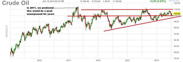
Notice the tremendous drop in oil from over $100/barrel to under $50:
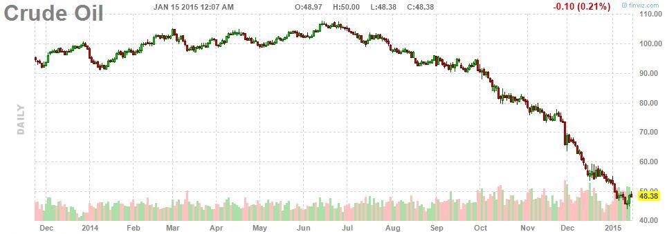
We've warned since oil peaked at $115 in early 2011 that oil prices are highly indicative of global economic growth and demand, as well as the inflation/deflation environment.
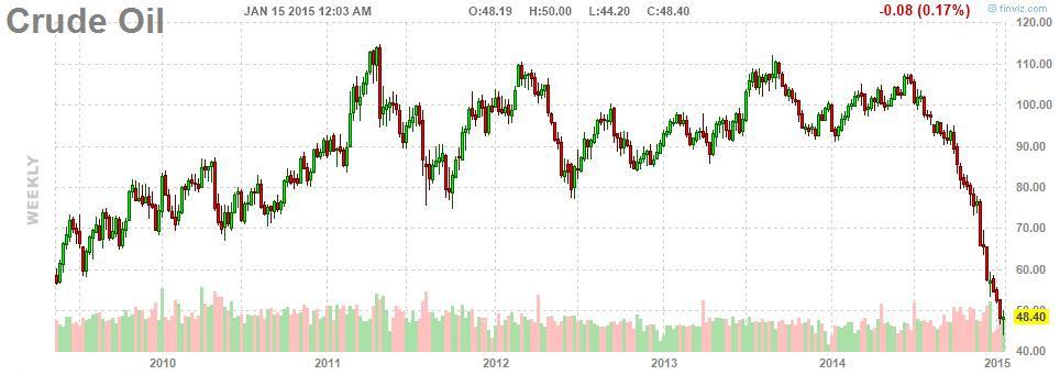
Oil under $100.Similar to copper, the price of oil also signals the health of the economy as well as the inflationary situation. As seen below, crude oil has not made a new high since early 2011. We actually predicted in 2011 that oil prices would not break out to new highs for at least a few years, and worse - that the falling oil prices were signaling a broader global economic slowdown in Europe, China, and emerging markets. Slower growth and weaker inflationary forces lead to lower oil prices, and oil found strong resistance at $110/barrel. Stuck in a range between ~$75-110, oil is at a critical turning point - it must choose between a breakout above $110 toward new highs or a breakdown below $75 toward the decade lows. However, since $100 seems to be a very important level where a lot of the price action has gravitated to, we view the $100 level as critical support. If prices fall below $100, and especially $90-95, the economic recovery could be in question as deflationary (and recessionary) forces take hold.
Since oil is historically so strongly tied to overall commodity prices, its direction is crucial to understanding and even predicting the stock market.
As you can see in the two charts below, oil prices have been strongly correlated to GDP growth as well as inflation [CPI]. The huge crash in oil is therefore no laughing matter and could be the #1 indicator of what's to come.
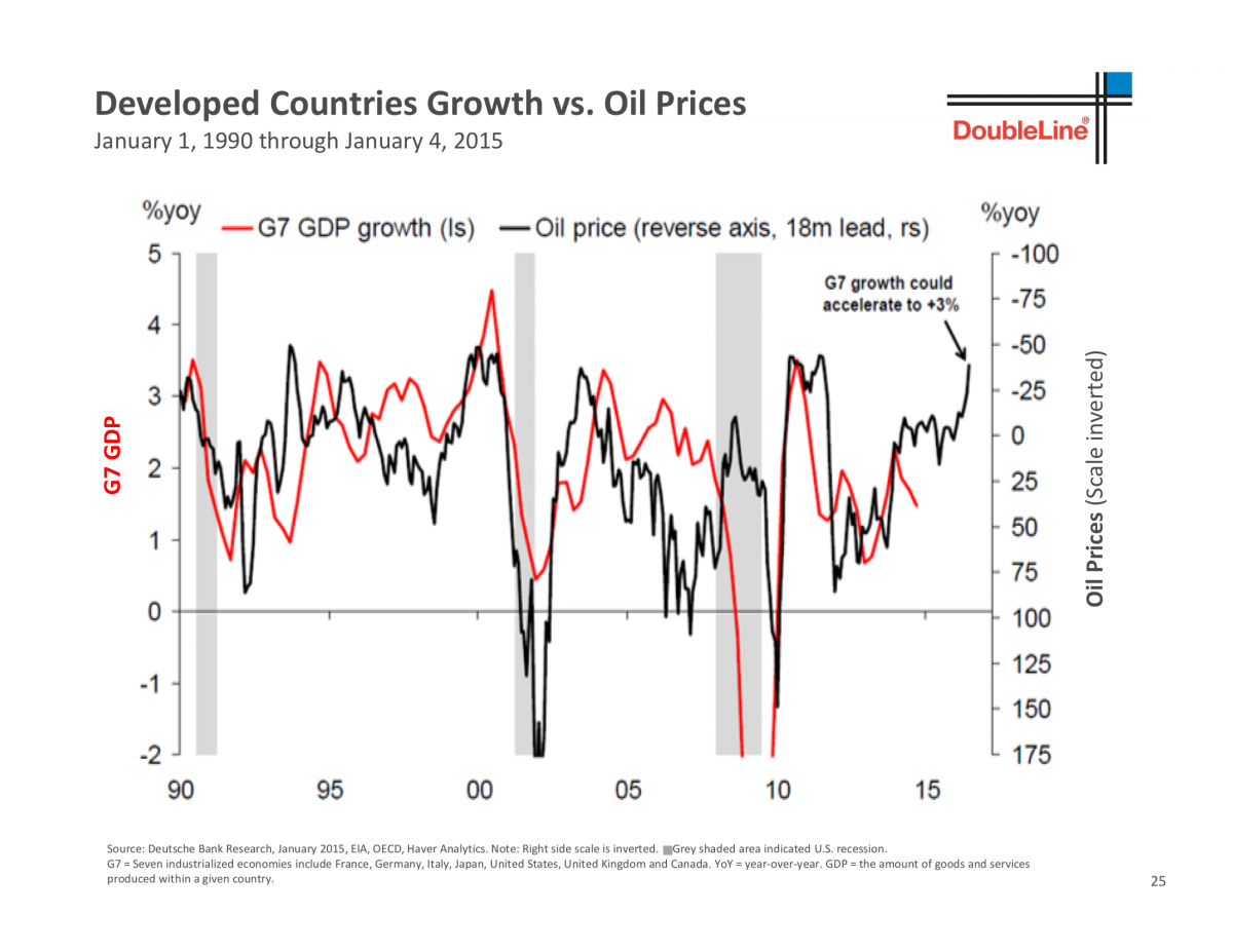
Source: DoubleLine http://www.businessinsider.com/jeffrey-gundlach-2015-outlook-2015-1
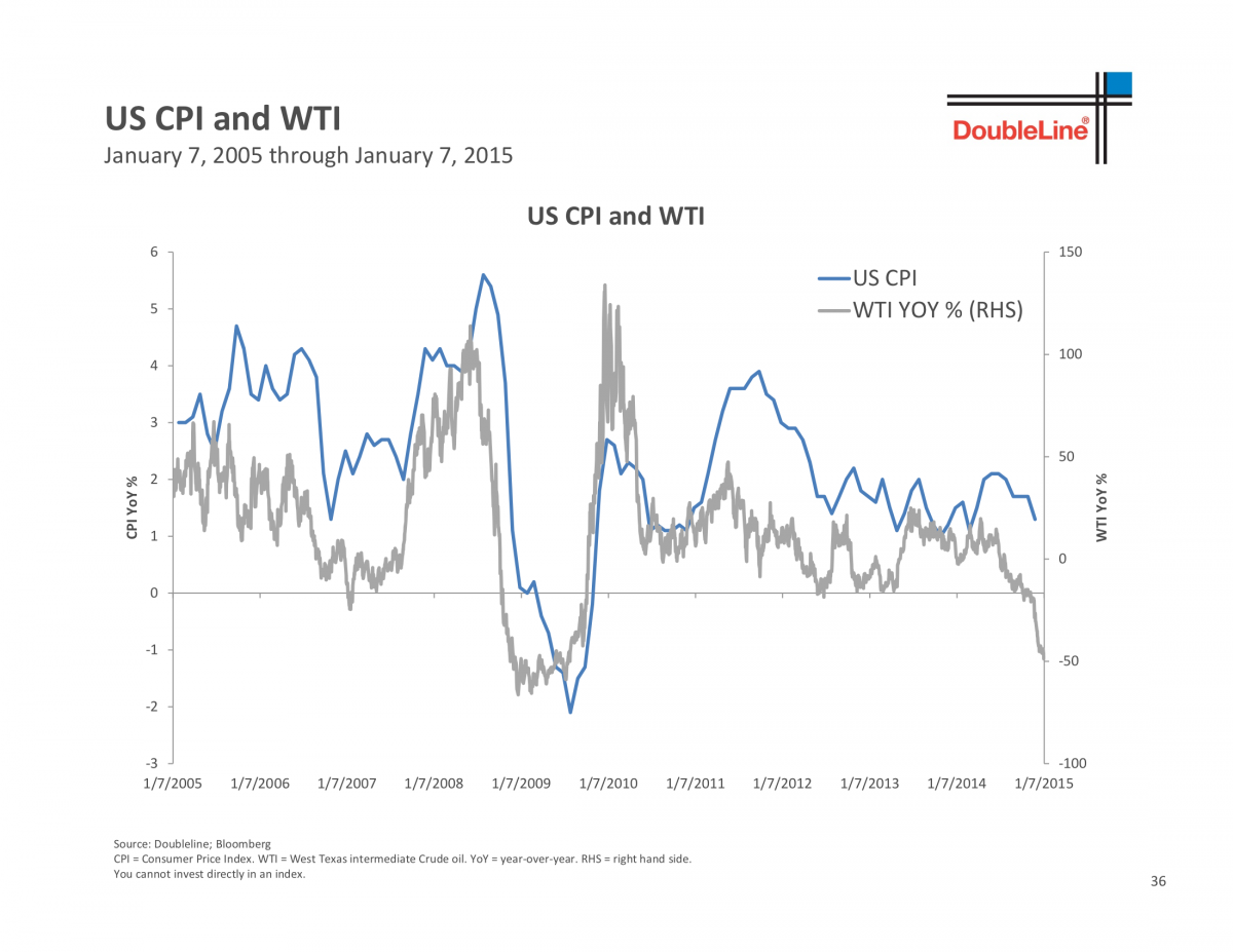
Source: DoubleLine http://www.businessinsider.com/jeffrey-gundlach-2015-outlook-2015-1
But oil's crash is extremely ambiguous this time. Since oil almost always moves together with the stock market, does this oil crash forewarn of a global economic slowdown? Is it a sign that huge deflationary pressures have finally overpowered the massive efforts by central banks to support and re-inflate asset prices? Or, on the contrary, does it actually bode well for the economy & stock market due to the much lower energy/input costs and the resulting big boost to the consumer?
Oil vs. S&P 500:
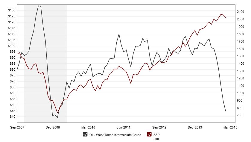
At this point, we are very concerned about oil's fall as a warning about the stock market, but we're also very open to the possibility that this may instead be an "enabler" for the continuation of economic growth (not in Russia though, which is probably entering recession since more than half of its economy relies on oil and energy exports). The US economy needed a boost to gain some momentum and fuel more growth; perhaps the huge drop in oil is exactly what it needed.
II. 3 Main Economic Scenarios
When it comes to oil & the economy, then, we are faced with 3 very different possible outcomes. The first and most bearish is the scenario in which oil's crash signals an upcoming crash or large correction in the stock market, also coinciding with or leading to a major (perhaps global) recession. This would mean strong deflationary pressures, falling asset prices, and slow or negative economic growth for 1-3+ years.
The second and most bullish scenario is that oil's drop, together with the sharp drop in commodity/input prices across the board, will lead to a huge positive shock and boost to the economy. In this case, the deflationary pressures brought on by dropping oil and commodity prices will be offset by inflationary pressures brought on by economic growth, increased spending, higher wages, and perhaps more stimulus or money-printing by central banks. It could very well be that the "energy revolution" in the US, our decreasing reliance on oil imports, and the achievement of a domestic self-sustaining energy supply is exactly what was needed to help the economy advance.
Finally, the third scenario is somewhere in between but bullish longer-term. In this case, the deflationary collapse in oil and commodity prices makes some sort of negative economic impact unavoidable, but allows for robust growth after the economy and/or stock market adjust to the new environment. Therefore, since negative impact is inevitable, a recession may be upcoming. However, since this is actually positive for the economy longer-term, the possible recession (if any) may be mild and (as we saw in the 1990s, for example) would be simply a slight pause or correction in the midst of a larger bull market.
III. Bullish or Bearish?
We are watching a number of major trends, flashing indicators, and ongoing events as pivotal early clues as to what could happen next. The following examples and how they evolve over the next months and years should be monitored, and their potential ramifications demand great respect.
1) U.S. Dollar Strength
The tremendous strength of the US Dollar is a major indicator and at the core of our concerns. Though thousands, even millions, of people have warned of the collapse of the US Dollar and its never-ending devaluation, most don't realize that the Dollar is up more than 25% since its multi-year low in 2011.
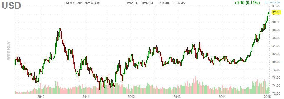
In fact, while everyone was complaining about the Dollar's "demise" and its negative impacts, we predicted at the exact bottom in April 2011 that the Dollar was on its way up:
With massive and extreme pessimism regarding the dollar and fiat currencies in general, driven by escalating fears over potential US government debt defaults, soaring inflation, irresponsible money printing by the Fed, and the possible overthrow of the dollar as the global reserve currency, fears of the "demise of the dollar" may be overblown.The dollar's strength or weakness has a much larger effect than many realize. It affects the stock market, bonds, commodity prices, debt levels, inflation, consumer confidence and behavior, foreign currencies, and even global policy. It is therefore crucial that investors, economists, analysts, politicians, and just about everyone else to monitor the US dollar's movement and potential effects on markets, economies, policies, gas and food prices, standards of living, and numerous other factors.Source: SeekingAlpha, Dollar 'Demise' Looks Overblown: Betting on a Short-Term Bounce or Medium-Term Recovery, April 26, 2011
However, don't confuse "strong US Dollar" with "strong US economy". In our predictions, we pointed out that a weaker Dollar is inflationary and is the Fed's attempt to "inflate" or boost asset prices by devaluing the Dollar through money-printing and quantitative easing (QE) programs. On the other hand, a stronger Dollar is deflationary and exactly the opposite of what the Fed intends. A stronger Dollar, we said, meant that asset and commodity prices would fall and that the deflationary impact could lead to a recession. The US Dollar's strength also makes US multi-national companies much less competitive in selling to global markets, which could severely affect many Dow and S&P 500 companies, for which international sales make up a significant chunk of earnings.
The stronger US Dollar could even be telling us more about Europe and Asia than it is about the US. Since the US Federal Reserve is now winding down its QE program, the lack of "money-printing" and additional stimulus is allowing the Dollar to gain strength. In addition, countries around the world are also embracing monetary policies which attempt to devalue their own currencies. And since currency devaluation is really a relative- or zero-sum game of who can devalue better than the others, it could be that other countries are devaluing while US Dollar strengthens. Right now it appears that Europe is closer to embarking on its own program in an effort to devalue the Euro. Moreover, the strength of the US Dollar is largely due to its status as a "safe haven" currency during times of economic distress or uncertainty. Perhaps an ongoing slowdown in Europe (NYSEARCA:IEV), China (NYSEARCA:FXI), or emerging markets is resulting in large inflows into the US Dollar as many flee to safety.
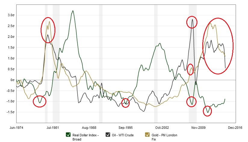
As you can see in the chart below, over the past 40 years (and probably longer), a long-term bottom in the US Dollar has preceded huge drops in oil and gold (NYSEARCA:GLD). If the historical correlation continues, gold and oil have further down to go.
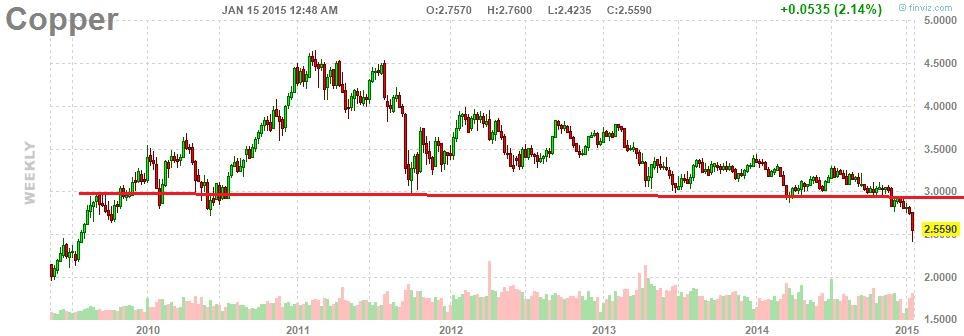
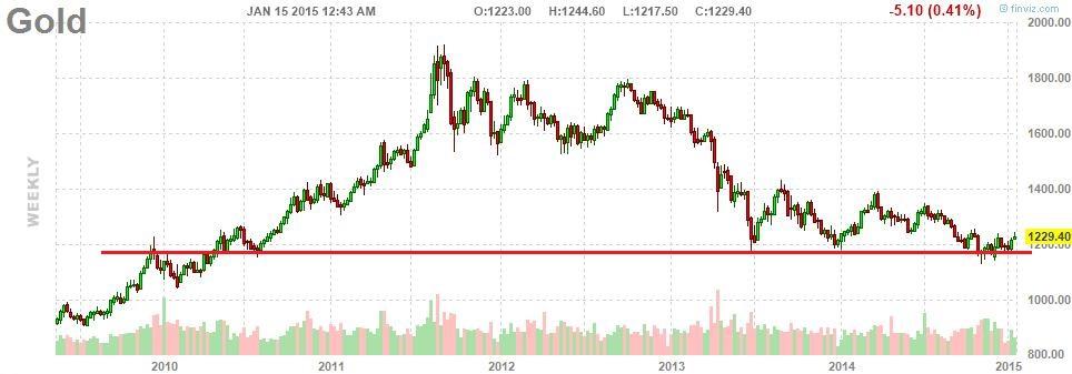
2) Commodities, Copper, Gold
The strength of the US Dollar did not affect just oil alone. The collapse in oil may be most discussed, but the destruction is visible nearly everywhere across the commodities space. Gold was down, copper's decline continued, and almost all commodities saw sharp drops in 2014 (see charts below).
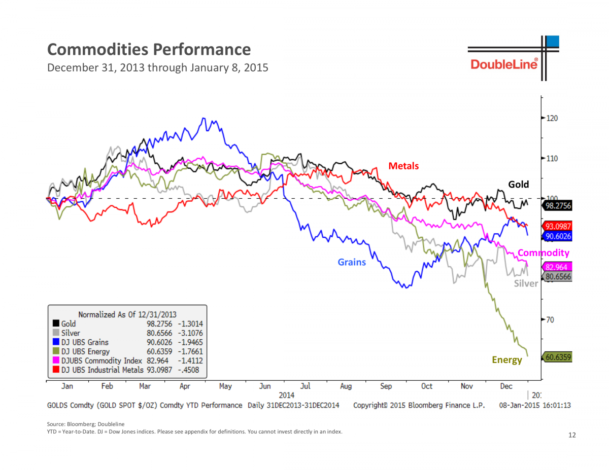
Source: DoubleLine

Source: Finviz.com
Copper's (NYSEARCA:JJC) drop is largely ignored, but could be extremely important. We even pointed it out as 1-of-6 things to look for in predicting the next recession:
Copper under $3.As we've mentioned a number of times over the past few years, copper is a major indicator of the health of the global economy.Why do we think copper is so important? Firstly because copper is a major commodity used heavily in many industrial settings and signals economic growth or contraction. Secondly, copper and the stock market have moved in direction so closely that their wide divergence since 2011 is a huge puzzle and may be a huge hint.Since copper is so strongly tied to manufacturing and economic growth, falling copper prices are an early hint as to the future direction of the stock market. In fact, falling copper prices were an early warning before the May 2010 correction and the 2011 crisis and slowdown. Now, as seen above, copper prices are struggling to stay above $3 and even broke below $3 for a very short time earlier this year. If copper prices fall below $3 again, a major stock market correction or even global recession could be near.
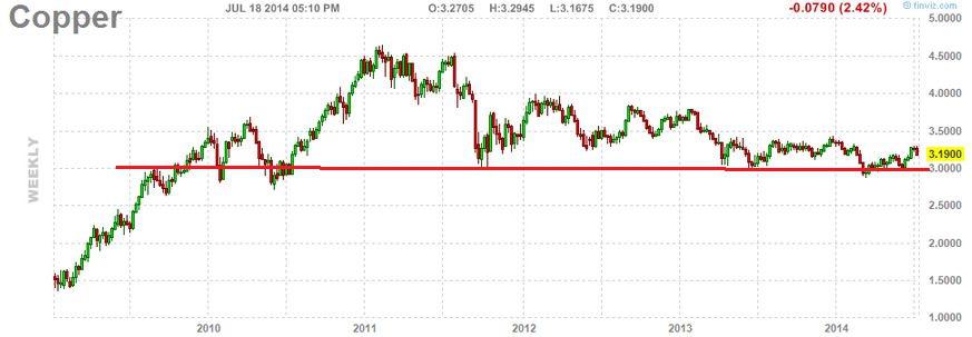
Since the publication of that article in July 2014, copper has broken sharply below $3 (see chart below). Though a reversal may come at any point and $3+ is possible, such a breakdown in copper is very disconcerting and could be a major warning.
Gold has found support at $1150-1200 and is attempting a bounce or move to $1300-1500. However, there are plenty of resistance levels above current prices and in our opinion this is just a counter-trend rally, as gold is already in a multi-year downtrend. If gold can even stage a comeback, we don't expect it to last too long or rise that far. We think we'll see $1000 (or $700) long before we see new all-time highs. Let's see if gold can break above $1300 or $1400, but keep your eye on the critical $1200.
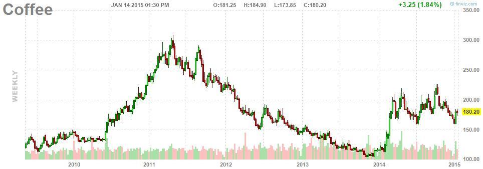
Not coffee though! While so many commodities fell in 2014, coffee (NYSEARCA:JO) has been one of the few exceptions, up nearly 100% at one point and looking like it may have begun a multi-year uptrend:
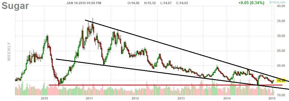
We also like sugar as an attractive long-term value play. So long as prices can hold above $14, this could be one of the best commodity investments over the next 5+ years. If sugar (NYSEARCA:SGG) can break out of the triangle pattern and hold above $18-20 (see chart below), $25-$30+ is easily attainable.
3) High-Yield "Junk" Bonds
Fueled by over-speculation, easy money, and years of cheap (to raise) corporate debt, companies have had a much easier time funding their projects or raising capital because investors have foolishly chased corporate debt for increasingly smaller returns. It would be one thing if corporate debt investors were compensated for the huge risks they take, because the threat of economic slowdown or recession could completely wipe out their returns as the underlying companies' financials become severely distressed. However, with "high-yield" debt earning nowhere near the returns required for such a potentially-toxic investment (close to 5%, compared to much higher historical averages), it could be only a matter of time until the death spiral begins and the market wipes them out.
The economy could certainly continue to improve and this disaster could be averted, but the momentum is definitely not in the right direction as we see high-yield debt suffering and diverging from the overall stock market.
As we also pointed out in How To Predict The Next Recession, Junk Bonds (NYSEARCA:JNK) are another 1-of-6 warning signs:
If a correction or recession ensues, junk bonds can plummet or crash. These companies may not be able to pay their debts, and many of these junk bond issuances can become worthless.Yet junk bonds are not only important in and of themselves. Their performance also tends to signal the direction of the overall stock market:In the above comparison of junk bonds [black] vs. the Dow Jones Industrials Average ($DJI) [blue], it is very clear that the rally in junk bonds has accompanied the rise in the stock market. Furthermore, it is highly noticeable that the stock market corrections since the 2009 bottom have also coincided with corrections in the junk bond market. The May 2010 BP Oil Spill, the 2011 financial crisis and European recession, and the following smaller market pullbacks have all seen corrections in junk bonds as well; sometimes junk bonds even lead to the downside and give an early warning indicator of the upcoming stock market drop.To make matters worse, since mid-2013 junk bonds have severely lagged the stock market and have formed a large divergence in performance. The stock market has continued sharply higher but junk bonds are weakening. Moreover, while the stock market is still at all-time highs, junk bonds appear to be rolling over. If junk bonds continue their slide, there is a very high probability that the stock market will follow.Source: "How to End the Next Recession"
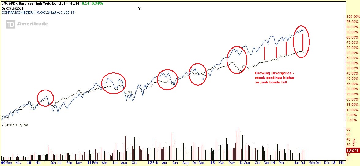
As it has turned out, Junk Bonds (NYSEARCA:HYG) have underperformed and diverged from stocks even more since July 2014. As the stock market set new record highs, Junk Bonds moved sharply lower.
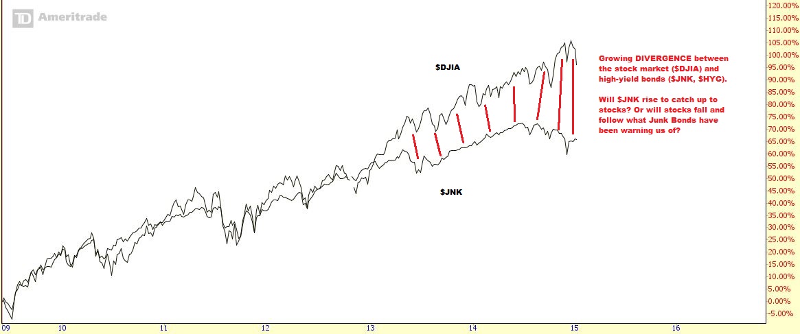
The two almost always cross over each other again; the question is: Will $JNK rise to catch up to the stock market's performance? Or will the stock market follow $JNK and drop sharply?
Or maybe stocks will continue to rally, extending what is already a wide gap between stock market ($DJI, $SPX) & high-yield bond ($JNK, $HYG) performance? Stocks have historically been the BEST place to invest over the long-term, far outperforming (and out-earning) bonds or cash. So it would make perfect sense to see stocks increasing their lead and continuing to run away from junk bonds if the S&P 500 continues higher.
To make matters worse for junk bonds, more news is surfacing that the high-yield corporate debt market was a major contributor to the huge imbalance in oil and energy prices. It could be that, as energy companies had an easier time raising debt, they drove oil prices way beyond their fundamentally-accurate levels. It is still unclear if oil prices were artificially elevated due to the high-yield debt market. So long as oil prices remained high, these energy companies could earn enough to pay off their debts. But with oil prices crashing by more than 50% in a matter of months, almost all previous forecasts and financial projections are severely inaccurate. Now that oil prices have crashed, it is clear that companies borrowed far more than they will be able to earn.
Stock market forecaster, Harry Dent, sums up the oil & junk bond situation well:
"Fracking is the process of injecting liquid at high pressure into subterranean rocks, fissures, etc., in order to force them open and allow more oil and gas to flow out of the formation, allowing it to be extracted at greater volumes…
Today, 65% of oil rigs are horizontal (rather than the traditional vertical style) and almost all of them need some degree of fracking stimulation to work…
Fracking began taking off back in 2005 and the debt to finance it began its acceleration in 2009…and what is driving this "boy wonder" industry that seemingly came out of nowhere, began leading us toward energy independence and has now inflated into a bubble about to burst?
It's simple: cheap money…Corporations have been borrowing at very low interest rates with the primary objective being buying back their own stock and artificially inflating their earnings per share. That's not a productive use of money. In fact, that is a sign that we are in a speculative phase with declining money velocity…In 2005, energy companies were 4.4% of high-yield (junk) bonds. Now they're 15.4% by one estimate, and I've seen estimates that claim 18% or even 20%...This industry has grown primarily from fracking in two states. Since 2005, production in Texas has doubled and North Dakota has tripled. Pumping out close to 2 million extra barrels a day, these fracking companies have become contributing factors in creating the excess capacity problem that's causing oil prices to tank 40% since August. What that shows us is… bubbles always burst of their own excesses."
Source: ECONOMY & MARKETS | 12.10.2014 | "The Fricking Fracking Bubble: Another Perversion from the Fed"
4) Volatility (VIX) - Complacency vs. Fear
The increasing volatility in stocks, measured by the Volatility Index (VIX), is another major warning. After almost two years of near-record-low volatility, the second half of 2014 saw a creeping rise in volatility (NYSEARCA:VXX) and even the first time the VIX reached 25 since the first half of 2012! If the VIX has truly made a low and built a base, it appears that volatility and stock market turbulence may be on the rise. If the VIX holds a breakout above 20 after already making a few strong attempts, the next stock market drop and corresponding volatility could be similar to or worse than what we saw in 2010 and 2011.
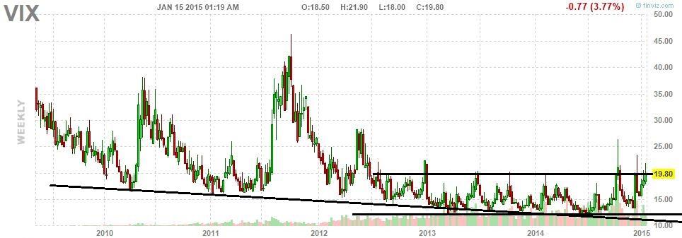
According to Sam Stovall, Chief U.S. Equity Strategist at S&P Capital IQ, volatility could definitely rise:
"In the past year the S&P 500 has endured around 40 days when it rose or fell by 1 percent or more. The average since 2000, however, has been closer to 80 times per year. Even back to 1960 the average has been 60 times in a rolling 12-month period. So no matter which way you slice it, investors have gotten off easy in terms of volatility over the last several years.So should we experience a reversion to the mean, investors will need to fasten their seat belts as they experience an increase in volatility. I don't see why it wouldn't happen, especially the closer we get to a rate-tightening cycle."
5) Market Momentum - Too Long Without a Pause?
Either a sign of great positive momentum or that a major bear market is upon us, stocks have continued higher and higher without much pause.
It has been 3 years without a big quarterly loss; and as you can see in the chart below, this has happened quite infrequently since 1900. When such an event did materialize, its occurrence has either been in the middle of huge bull markets (1940s-1950s and 1980s-1990s) or, much more ominously - at the 1929 peak right before the Great Depression, just before the 1960s/1970s bear market, and near the 2007 peak of the Housing Bubble.

Source: Sentimentrader
7-Year Streak
If the stock market is up for 2015, it would be the first time EVER that the US stock market is up for 7 straight years (2009-2015). DoubleLine's Jeffrey Gundlach mentioned this in support of his bear-case. Yet although the market may impressively keep rallying and close 2015 higher, history says it is very unlikely.
Below is a chart displaying % gain/loss each year for the S&P 500. As you can see, even the best bull markets need some sort of pause or correction before continuing higher:
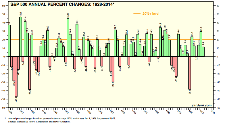 Source: Yardeni Research
6) Favorable Historical Stats
Yet history also points to a positive outcome for 2015:
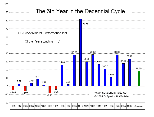
"When you look to history there's a whole handful of indicators pointing to a positive year ahead. Traditionally, the third year of any president's term in office has been the strongest of all four years of the presidential cycle, rising an average 16 percent for the S&P 500 since World War II versus 8.8 percent for all four years. In addition, the market rose 88 percent of the time versus the more normal 71 percent frequency of advance. And the two times the market did not rise, 1947 and 2011, the S&P was flat…Finally, the S&P has never declined in years ending in 5 since 1905, and rising an average of 24.5 percent, with only two observations in single digits."
According to Sam Stovall, [1] the third year of a president's term has shown nearly double the average return (16% vs 8.8%). Additionally, [2] the market was up 88% of the time - more consistently than the 71% average. Even more, [3] the only two times the market did not rise on a third year of a presidential term, the market was flat. Finally, [4] years ending in 5 have been wonderful for the stock market, without a decline since 1905 and averaging large double-digit gains.
CNBC's Jim Cramer discussed research by Ed Ponsi that also pointed to the third year of the presidential cycle as favorable for stocks. Cramer's data goes back further than Stovall's, but both lead to the same conclusion- historically, it's the best year of the cycle.
From 1833 to 2012, the stock market has on average rallied 1.9 percent in the first year of a president's term, 4.2 percent in year two and 5.8 percent in the fourth year. Year three is the biggest, and has a return of 10.4 percent market gain in the Dow Jones Industrial Average.
All this would lead us to think that the stock market has a decent chance at a positive, or at least flat, year.
Notice the very favorable historical performance in years ending in 5:

Source: BusinessInsider.com
7) The "Hindenburg Omen"
The notorious "Hindenburg Omen" is yet another indicator currently flashing red warning signs. It has been too early or even wrong a bunch of times, but itmust be paid attention to because it appeared right at the 2007 peak, near the 2011 crash, and at a number of other momentous peaks. Worryingly, since mid-2013 there has been a cluster of these signals. It could be wrong, but ignore at your own peril.
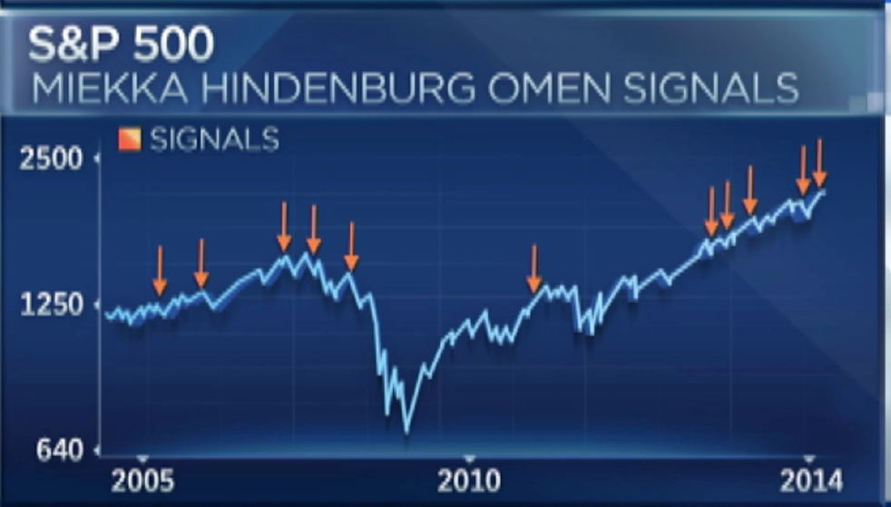
Source: CNBC / Yahoo Finance
8) Over-Heated (and Under-Performing) IPO Market
IPOs have been performing poorly, at levels not seen since the Tech Bubble (NYSEARCA:XLK). The bull market in stocks and the investors' growing appetite for speculation have enabled many companies to go public through "initial public offering", aka IPO. Yet lost in the enthusiasm and euphoria is the reality of whether many or most of these companies are even viable in the long-run.
Well, the stock market has been deciding and, as can be seen in IPO performance (see chart), it has decided that many of these companies are not worth their valuations.
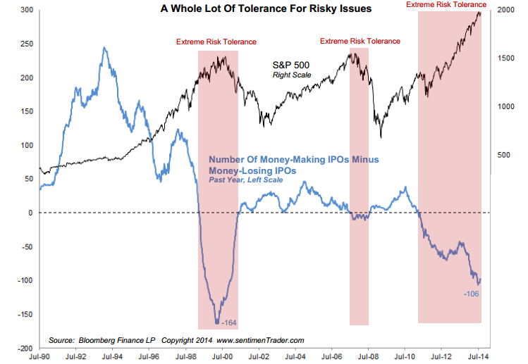 Source: Sentimentrader.com, August 28, 2014.
When "money-losing" IPOs greatly outnumber "money-making" IPOs, the stock market is at much higher risk of a correction. Since 1990, this has occurred only 2 or 3 times (if you count the 2007-2008 period); and though it may have been too early this time (2011), it did in fact precede the 2000 DotCom Bubble peak and the 2007 Housing Bubble peak.
There are plenty of anecdotal examples of the fervor and over-excitement about technology startups and IPOs, such as Uber's rapid (and unsustainable?) rise.
Uber raises $1.2B at $40B valuationRide-sharing giant Uber has raised another $1.2B at a $40B valuation - more than 2x the $18.2B valuation Uber was granted only in June, and more than 10x the $3.5B valuation granted in a 2013 funding round featuring Google.Source: Seeking Alpha, Dec 4 2014
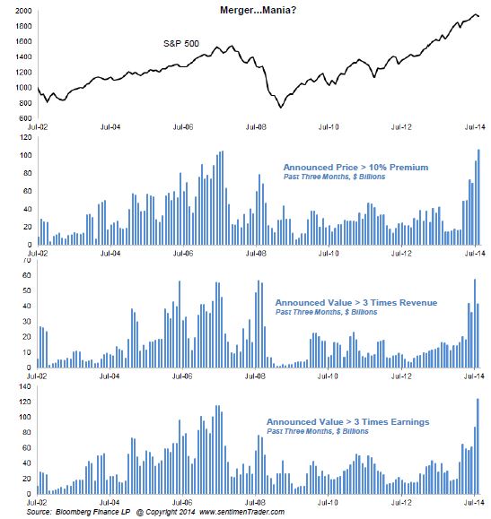
9) Merger Activity
Similar to IPO activity in revealing clues to market tops & bottoms, extreme levels in merger activity are usually reached near market peaks.
What this means is that near-record levels in merger activity should be noted as a very serious warning indicator for the stock market. Companies usually engage in mergers and make these types of decisions only when they think the market is healthy and there is room for profit. However, many big deals & mergers are the result of over-enthusiasm and over-speculation rather than true value creation; and by the time these multi-billion dollar companies finally make a decision to merge or expand, it is usually far too late. It is therefore exactly during times of massive & record-setting merger activity (or business activity more broadly) that market tops tend to form.
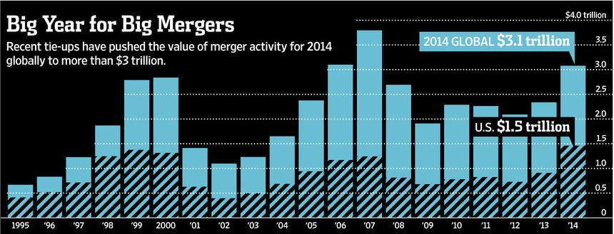
Source: Elliott Wave International / Bloomberg
Extreme levels in merger activity were seen in 1999-2000, 2006-2007, and appeared again in 2014. The good times could definitely continue for another 1-3 years as the merger activity continues higher, but these levels have historically been much closer to a top than the middle of a trend.
10) Margin Debt
2-for-2 in nailing the Tech Bubble and Housing Bubble, the record-high Margin Debt on the NYSE could be warning of another peak. Margin Debt is the sum of what investors are borrowing in order to enable or leverage their trading. Generally, a little borrowing isn't too dangerous and has its benefits if done correctly. However, when investors become too reliant on borrowing or when they leverage their positions too much, they could be in big trouble. Instead of losing just the principal initially invested, margin debt can amplify and even multiply the losses. When many investors are trading and leveraging borrowed money, it only takes a small market sell-off, which can easily escalate, to wipe them out.
 Source: DoubleLine
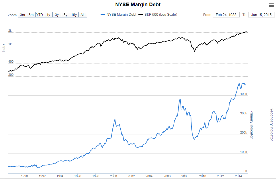
Source: Sentimentrader.com
11) Unemployment And Jobless Claims
Low unemployment is great, but it might also signal a stock market peak or an upcoming recession. Ironically, recessions usually begin soon after (or coincide with) a major low in unemployment. What that means, is that right when millions of people have jobs or have recently found employment is when the economy begins to weaken. Everyone complains for years as employment is actually improving, but fails to realize that it is most likely when jobs are plentiful that trouble begins. The job market is calm right before a storm.
Since 2009, the job market has improved tremendously and jobless claims have been in a consistent decline, representing a better employment situation. How long will it last?
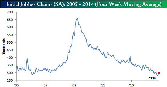
Source: Bespoke Investment Research
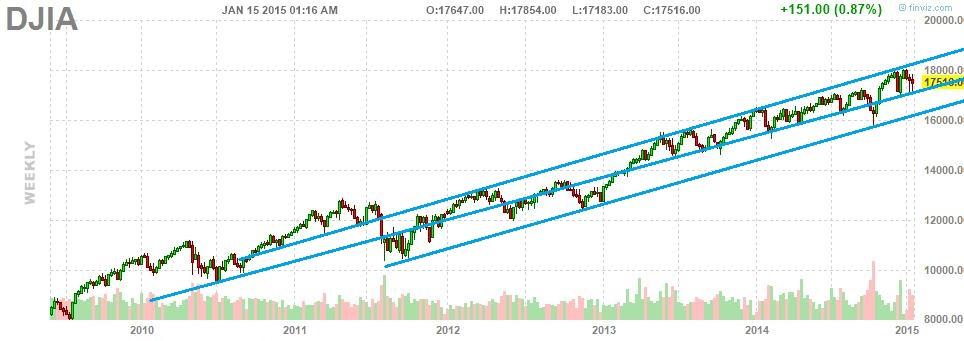
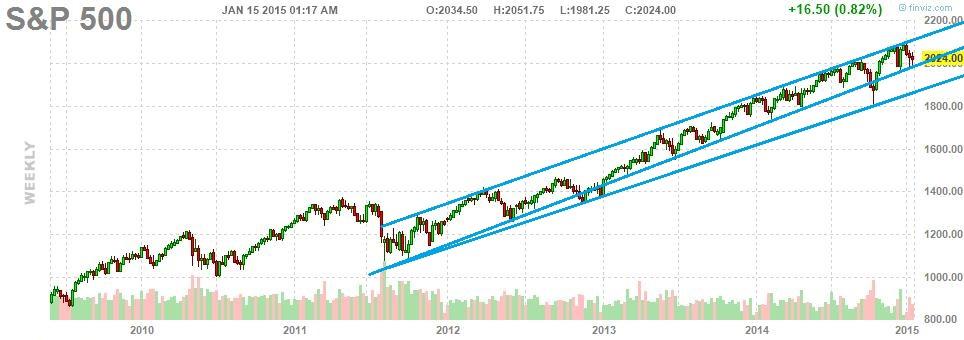
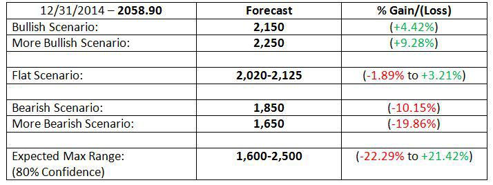
IV. Levels To Watch & 2015 [END-OF-YEAR] TARGETS
The following are important levels to watch on the Dow as areas which stand as support from below, but which also could transform into strong levels of resistance from above if the market were to fall through them to the downside. The importance of the key levels is due to one or more of the following: previous highs, recent lows, support/resistance, 50 week MA, 100 day MA, and round psychological numbers.
There is quite a bit of support ranging from 15,700 to 17,400, and especially a confluence of data pointing to approximately 16,000 to 16,400. Since that is the case - though we are very aware of the dangers and risks which threaten to topple this market at any moment - we are fairly confident that the MAX DOWNSIDE range for 2015 is between 15,400 (would be -13.6% from beginning of year) and 14,800 (-16.96%) on the Dow Jones Industrials Average ($DJIA). Although a sharp recession or crash could definitely take it far below these levels, the MAX DOWNSIDE stands as a very strong support zone which is nearly impossible to penetrate on a first attempt. Rather, if the market were to even drop that low, it would bounce or at least give investors some time and an opportunity to exit before the next leg down.
In order to calculate and estimate our year-end targets for the Dow Jones Industrials Average ($DJIA) and S&P 500 ($SPX), we combine many different techniques and look for a consistent result across the board. The more evidence or supporting data we have, the higher our confidence and accuracy.
DOW JONES INDUSTRIALS AVERAGE

S&P 500
No comments:
Post a Comment